


A quick glance at my computer, you'll see that I'm a bit of a font collector. Bold, fanciful, script, and even doodle fonts. Please don't get me started on font pairings…
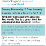
One of my proudest moments came a few years ago, when I influenced my school to start using fonts from Kimberly Geswein (see ya later Comic Sans).
I think it's because they offer us a low-risk opportunity to show off our artistic side and maybe even a bit of our personality in our work.
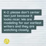
There is one place I draw the line though – using these fonts in visual models for my students.
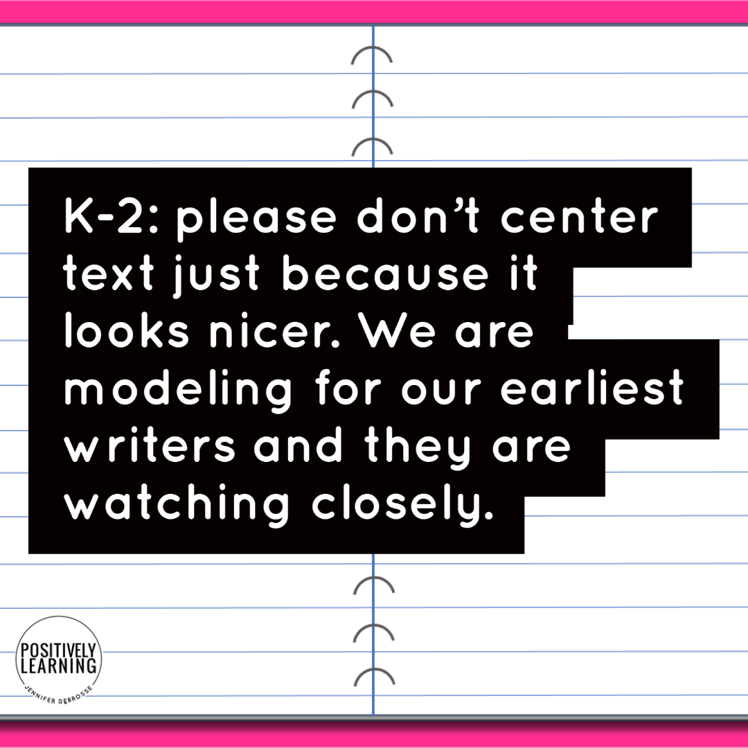
I recently posted the above plea on social media and engaged in fruitful conversation with other educators.
You can read the post here, but in a nutshell, I was pretty mortified once I realized the negative impact some of my “decorative” choices were having on my struggling writers.
#knowbetterdobetter
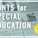
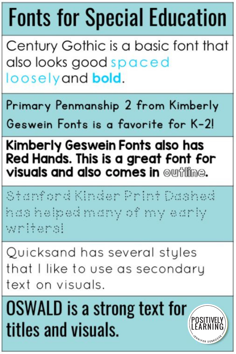
I was asked to share some of my favorite fonts for special education. My first instinct was “no thank you” as I'm not a font expert in any way, shape, or form.
I decided to go ahead though in case it helps even one other educator.
Please leave a message and let me know – I'd LOVE to check it out. Thanks 🙂
Interested in joining a community of special educators preparing for their most organized school year?
Join our Facebook community for special educators!